Are you a designer within a software company? How do you manage your tasks and collaborate on those with your team? At Codefresh we use Jira for managing all our R&D and design tasks. This post provides an overview on how we manage design related tasks in Figma and ensure the issues are visible within Figma through the use of components. If you are new to components, have a look at our previous blog post on how we use components in our Design System.
At Codefresh, for every Jira ticket, we create User Stories with all the specifications about the task including the design. Sometimes we add a link to the Figma frame and sometimes we add screenshots of the design directly into the ticket. This works rather well. The issue is that on the Figma side, we may have multiple versions of certain designs, or multiple user stories relating to a similar component that will be developed at different times. Old designs were abandoned or simply postponed in the development pipeline. This causes a lot of confusion on the Figma side. To change this, my goal was to add references directly in Figma to each ticket and add additional information to the design depending on the ticket that it refers to.
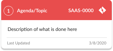
What I came up with are two helper components:
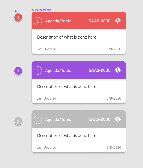
The notecard, and note number.
Let’s break down all the elements we have here:
- The item number – The item number is used in case I have multiple cards on the same design and I want it to be clear about the card referenced by the design.
- Agenda/Topic – This is a short title for the card usually similar to the JIRA ticket name.
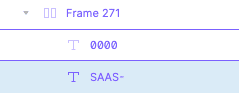
- Issue number – This is composed of two different text fields for ease of use. One field for the project name (this rarely changes) and the second field for the issue number, which changes often.

Component Specifications related to the Jira issue - Description – Here is where we add any and all info regarding this design task that you want the developer or stakeholder to see. Details about the interaction, context when this design is displayed, anything at all.
- Last Updated – This is very useful. Simply adding a date on when this was changed or when this design was created can add a lot of context when you come back to it after a few months.
- Color – We use three colors:
Red – Active user story
Purple – New feature request
Gray – Completed
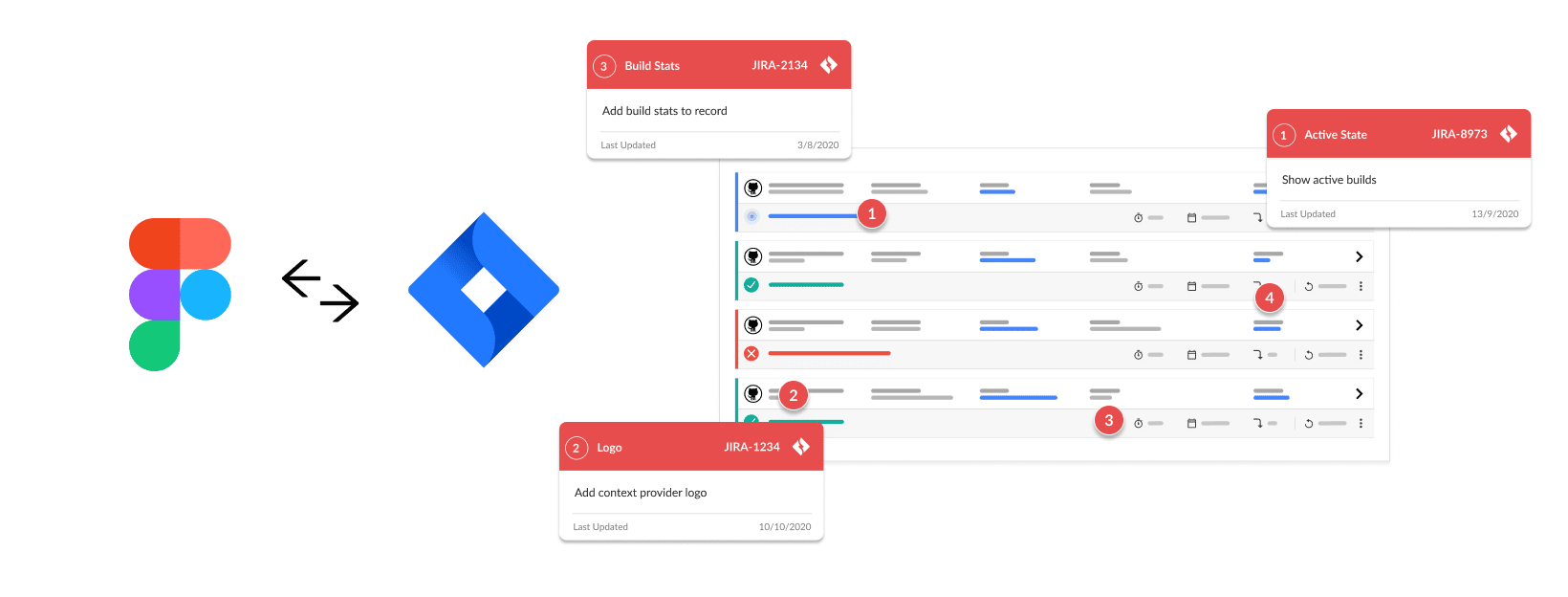
Let’s look at a live example:
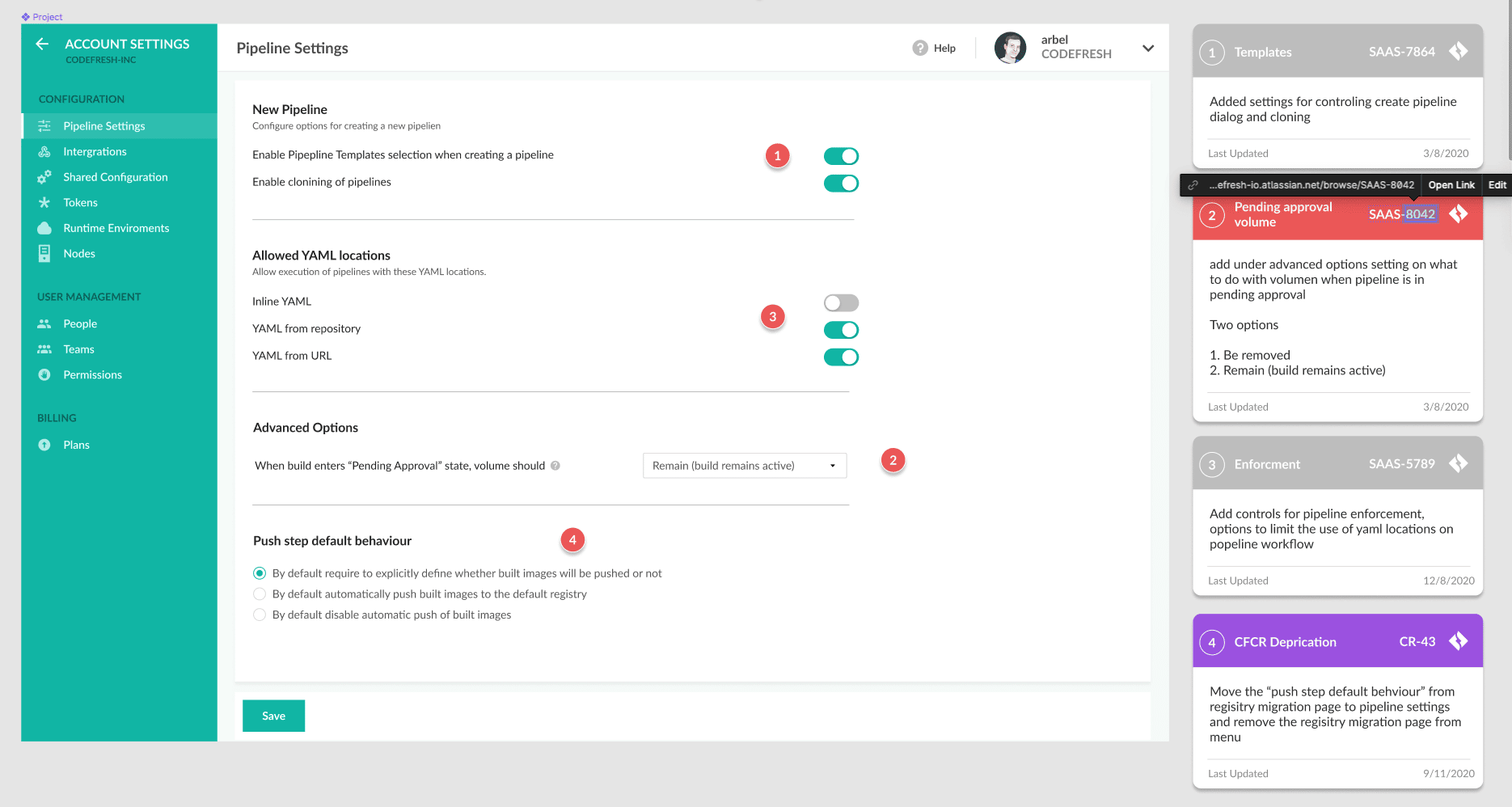
This is a relatively new settings page in the product. It contains various settings for different features that have been added recently.
As you might assume, not all of these options were added at the same time, and not all are implemented. This can cause a lot of confusion to a developer that has been asked to work on a certain user story that requires adding settings to this page:
1. The live page might not look anything like this.
2. The developer’s task is to add only part of these settings and not all of them.
With the helper notes, it is clear what parts of the design are related to what Jira task. Each item has a short explanation and it’s easy to understand what items have been completed, what items are currently being worked on, and what items are future tasks.
Feel free to Remix this design:
https://www.figma.com/community/file/890570146439157834/Jira-Helper-Cards
In the future, I plan to write a plugin that will sync Jira ticket information directly into Figma and vice versa and send updated links to Jira according to the ticket number. Let me know if this is something you’d be interested in and maybe we can get it done faster.