Figma is a web-based graphic editor and prototyping tool that is commonly used for UI design. Independent of the size of your organization, it is considered good practice to use design components. This post provides a case study on how we utilize Figma components to manage different states in the Codefresh UI.
Note that this blog post was written before the release of variants and the new auto-layout features. We will update the blog after we update our style guide with these new amazing features.
Our Build Record
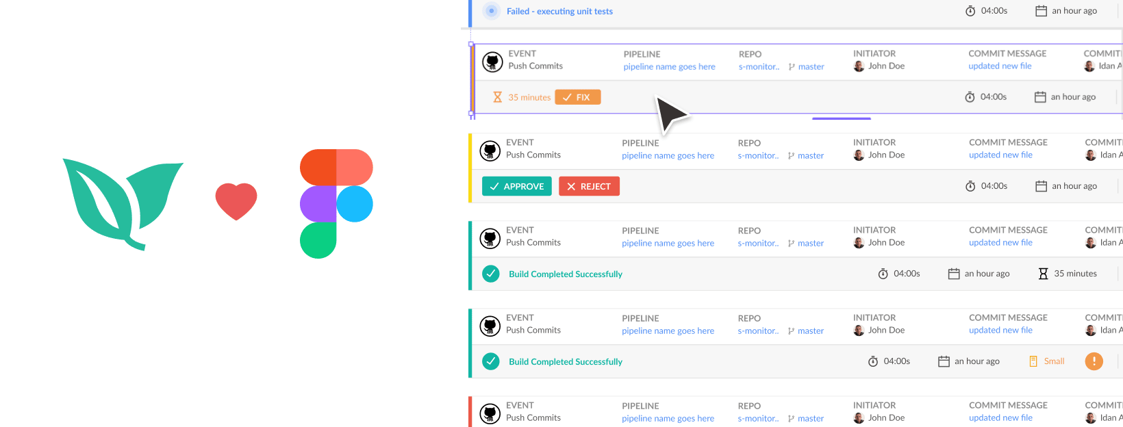
One of the most complex design components in the Codefresh UI is the build record header. There are simply so many variations to each part of it that you could easily lose count trying to connect all the records.
Let me show you how we recently redesigned the header of our build record in Figma. To make it easier to view and modify the different parts, we broke it down into different components.

Let’s start with the top row. This is the event information, which changes for each Git event.

The fields within the header change in accordance with different Git events. We created a component for each section so that we can easily swap them out depending on which Git event we want to demonstrate.
As you can see, each Git event is composed of similar fields with slight variations.
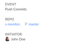
The fields differ between:
- Plain text
- Link
- Icons
- Avatars
- And combinations of the above
We call this component a stat item and we use it quite frequently. Here’s how it looks in our design system:
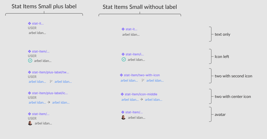
We differentiate between two versions; the first one has a label included, and the other one does not. Additionally, there are several variations of the fields displayed. This allows us to standardize components without duplicating them.
In comparison, we could have just created one version with the label and swapped out the internal instance for that stat item. However, this would easily become difficult to follow. Providing two versions is more intuitive to use and utilize in our design system.
For instance, the stat items are nested in a frame with a layout grid:

The design specifies a grid of six columns, with a gutter of 20 pixels.
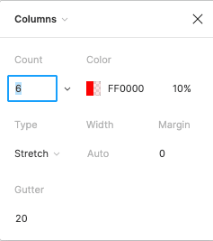
This enables the element to be responsive while maintaining spacing between each item.
In order to achieve this, turn on the layout grid and place each item on the left edge of the grid column. Next, set the alignment for each item to the left.

On the second row, going from left to right, we have:
- A status indicator
- Status details
- Additional information with icons
- Memory and log information
- Action buttons
The status indicator and status detail components have several variations. We created a component for each:
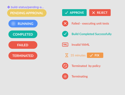
Again, having all states defined as components allows for easy switching between them. Similar results could have been reached using overrides but that would force us to do them each time we want to demonstrate a new component, which easily leads to inconsistencies.
The next section displays additional build info:

The above is built from individual components called build stat items. An example is provided below:

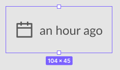
All of the above are pretty simple components that include an icon (component instance) and a text layer. They are grouped in an auto-layout frame so that we can remove certain items as they do not all appear at the same time.
This is also nested into an additional auto-layout frame with the horizontal alignment set to right.
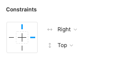
What this achieves is that when you remove an element, all the items shift right, instead of the default left.
The rest of the items are pretty simple. They are additional types of components, all nested inside the auto-layout frame.
Key takeaways:
- Everything should be a component; this allows you to easily swap out elements and keeps your designs consistent and easy to maintain.
- Sometimes it’s worth grouping several items into additional components if they are logically bundled together.
- Autolayout is your friend. Use it often and don’t be afraid to wrap frames into additional frames several layers deep.
- Using a layout grid allows you to set up more complex responsive elements.
We hope this tutorial was helpful and provided you with useful tips on how you can optimize the use of components within your design system. Please share any feedback and ideas you might have in the comments.
If you would like to see the components in action, Create Your Free Codefresh Account NOW!
