
Here at Codefresh we love Figma and use it for all our design tasks.
In this blog post, we’ll show you
- how we have built our modal in Figma and
- the way it is broken down into components for reusability across our designs.
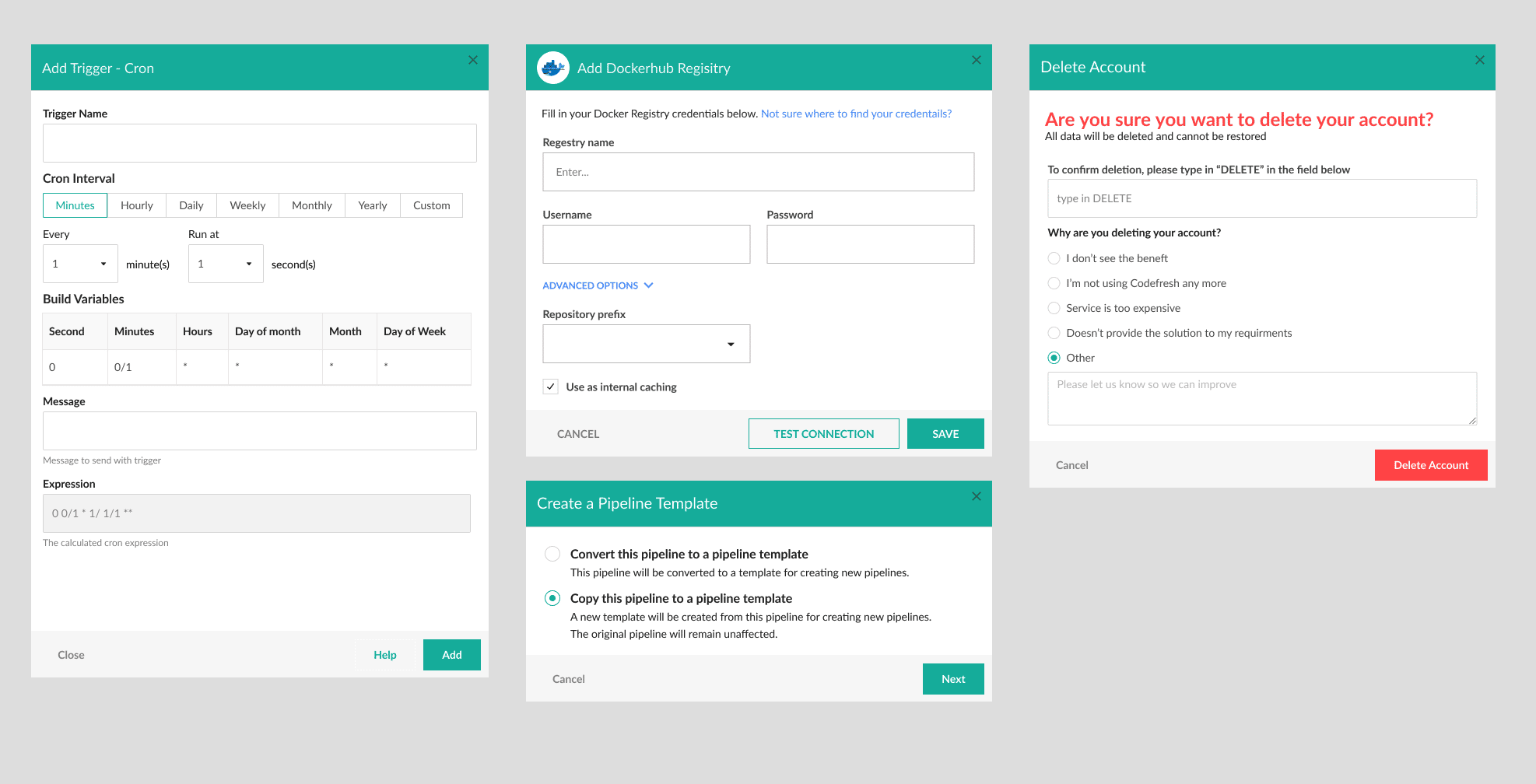
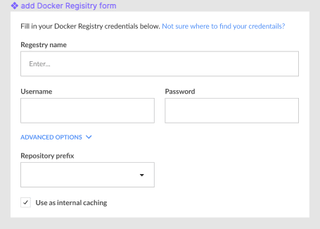
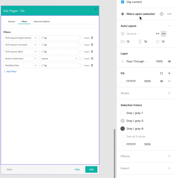
As part of our application, we have modals. These are little popup windows that are shown to the user either to include additional settings or to provide information in response to events. Examples are provided below:
When we are creating a new modal, our goal is to make each modal flexible enough that components within can be reused. As a result, we will not have to create separate components for each modal design.
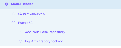
We can break each modal into the following parts:
- The Header – the title text will change between different modals. The text itself can easily be overridden in Figma. However, notice that the middle screen in the example screenshot provided above has a logo/icon next to the title. That’s something we’ll need to take care of.
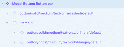
- The button bar – we have multiple options depending on the use case: The number of buttons changes, the type of buttons, and of course the text on the buttons are also different per modal.
- The content – this part is completely unique to each modal and should be treated as such.
Let’s see how this will look in Figma.
The Header

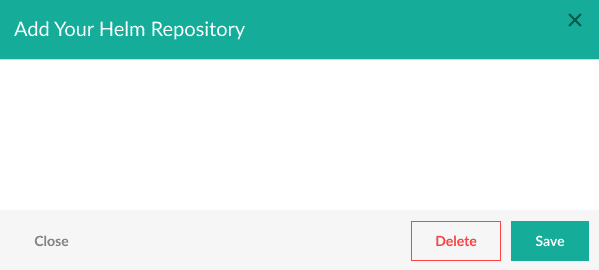
The header is pretty simple: A frame with a background color, and a “Close” icon in the corner.
❗Tip: make sure all your icons are components, this allows you to swap them out and reuse them across components.
The final part is the text logo and title, this uses an auto-layout frame. Why is it important to use an auto-layout frame? Well, as you have seen in the example on the top, we do not always have the logo, in which case, we want the title to move to the left to avoid leaving a gap where the logo should have been. By hiding the logo when it’s nested inside an auto-layout frame the text will automatically shift to the left. This is one of the key benefits of using auto layout.
The Button Bar

This is quite similar to the header. We have an auto-layout frame aligned to the right. The frame includes button instances. Remember, since the buttons are instances, we can easily swap them with any other button in our design system.
The Modal Component
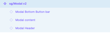
This is where most of the magic happens. The modal component is an auto-layout frame with three instances nested inside it: the header, the content, and the button bar. You might notice that the modal content is an instance, which is currently empty. This is because it is used as a placeholder.
To create a new modal window, we follow this process:
- First, we create a frame with the content of the modal;
- Next, we convert the frame into a component.
Remember the tip earlier for using components for icons so you can easily swap them out? This also applies to the modal content itself. By creating a component of the modal content, we can easily change the content.
Once set-up, you can easily change the content:
That’s it! Following these few tactics creates pretty simple yet versatile and useful components.
If you have any questions or would like to provide us with feedback, please comment below and join our community chat.